
BRAND CREATION
The initial kickoff included the creation of moodboards and brainstorming name ideas. With the top name ideas the team came up with, we created logo concepts. This is a selection of the logos I created for this part of the process.
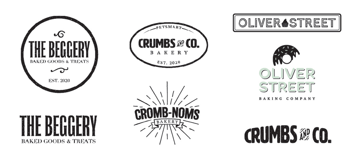
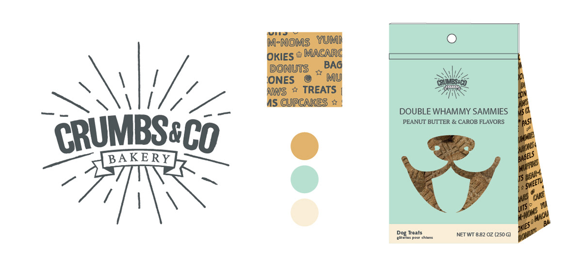
The "fireworks" logo from the above explores was changed to Crumbs & Co and I began concepts for the product packaging. The packaging, evoking "graffiti", used hand-drawn fonts and illustrations to add an authentically crafted vibe. The color palette was a modern take on vintage designs to appeal to Millenials, the target customer base for this brand.
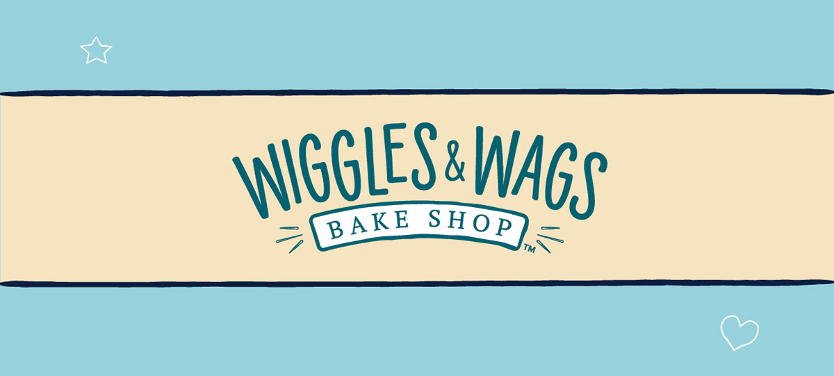
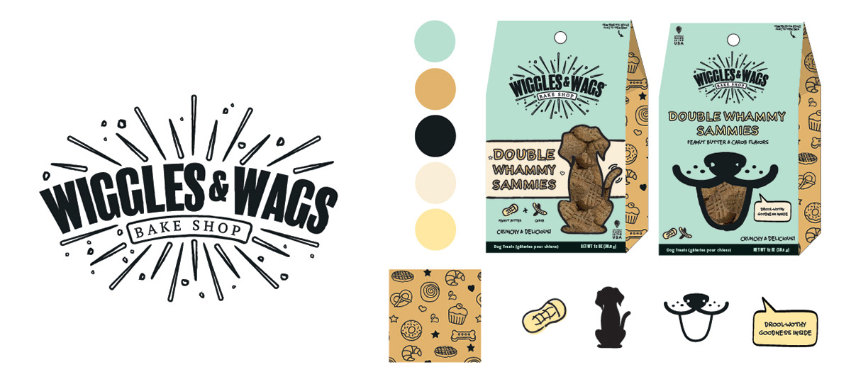
Around this time a focus group landed on the name "Wiggles & Wags". I adjusted my concept to this name and developed a new pattern of treats and doodles, leaving the word pattern behind. The color palette remained the same, but the window cutouts on packaging evolved into two options, a dog silhouette, and the dog face. I also developed icons and typography styles with hand-sketched outlines with offset fills.
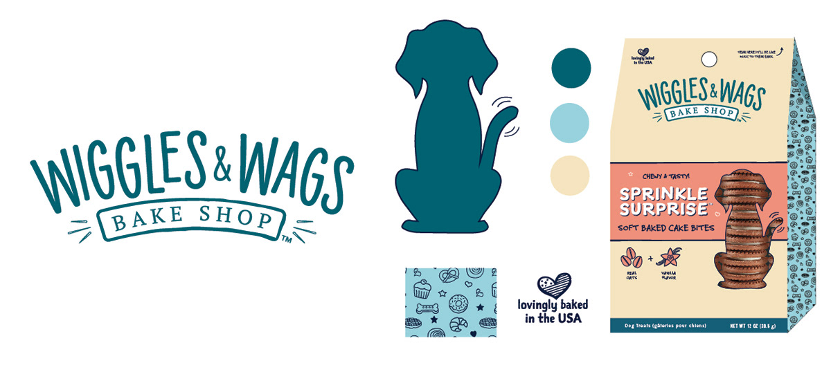
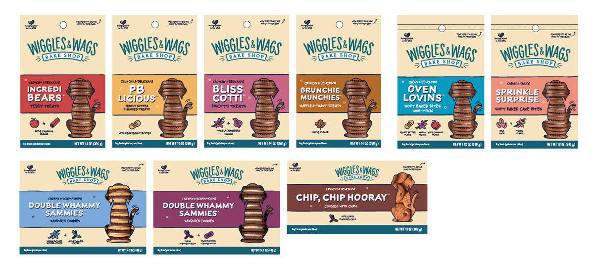
At this point my concept was selected from the various options and further refined. The logo was simplified and introduced color, and the fireworks were reduced. The dog silhouetted was selected, and the color palette changed to incorporate bands of color to indicate the flavor profiles of the different treats.
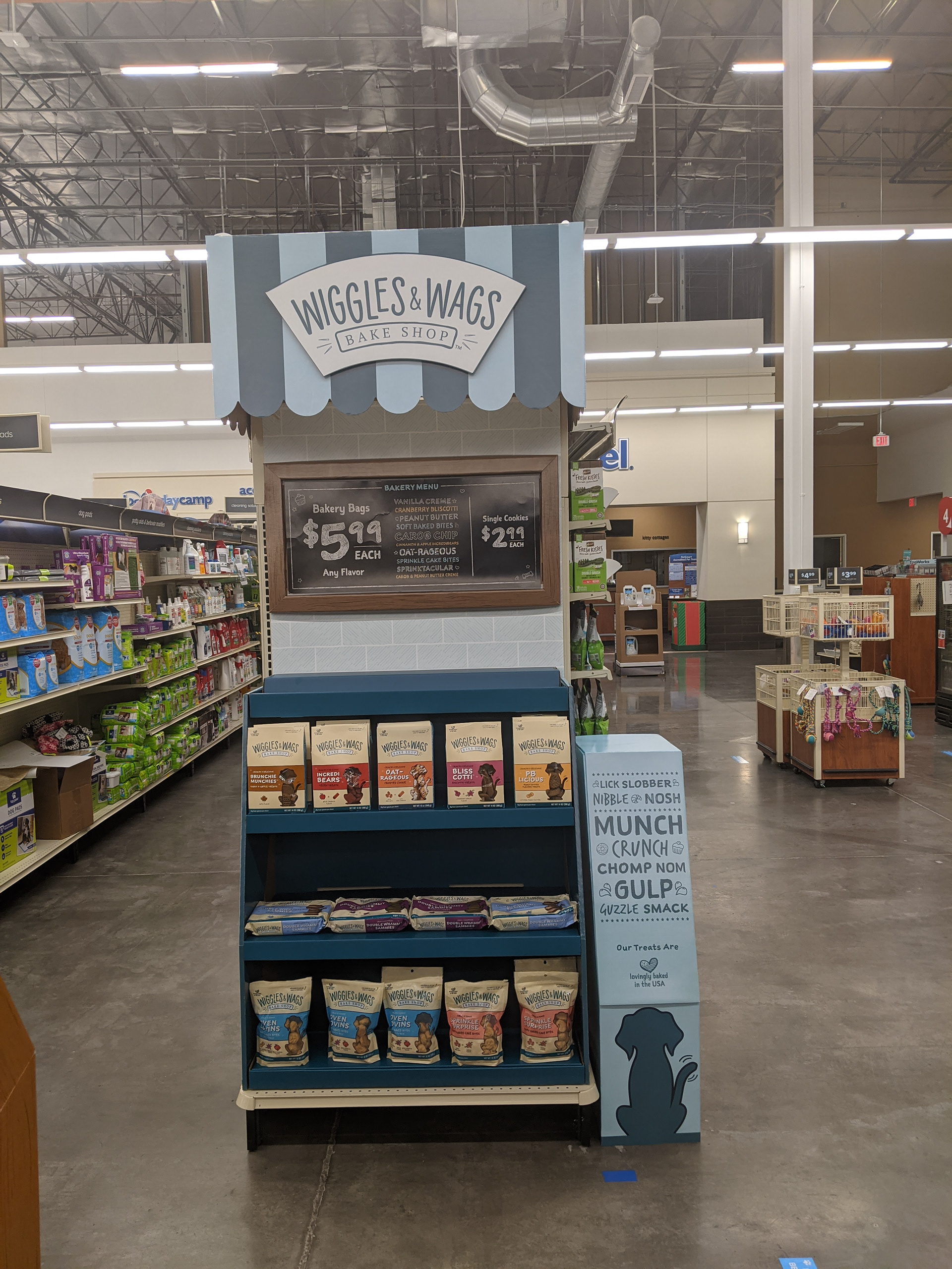
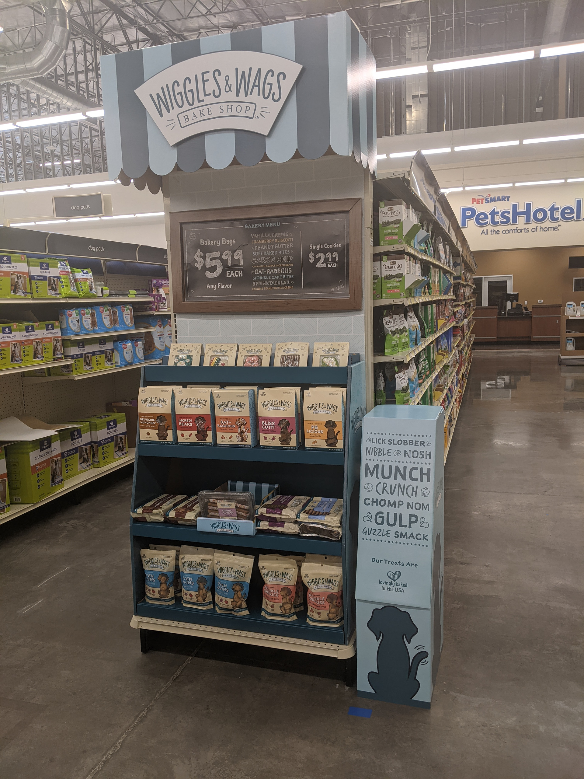
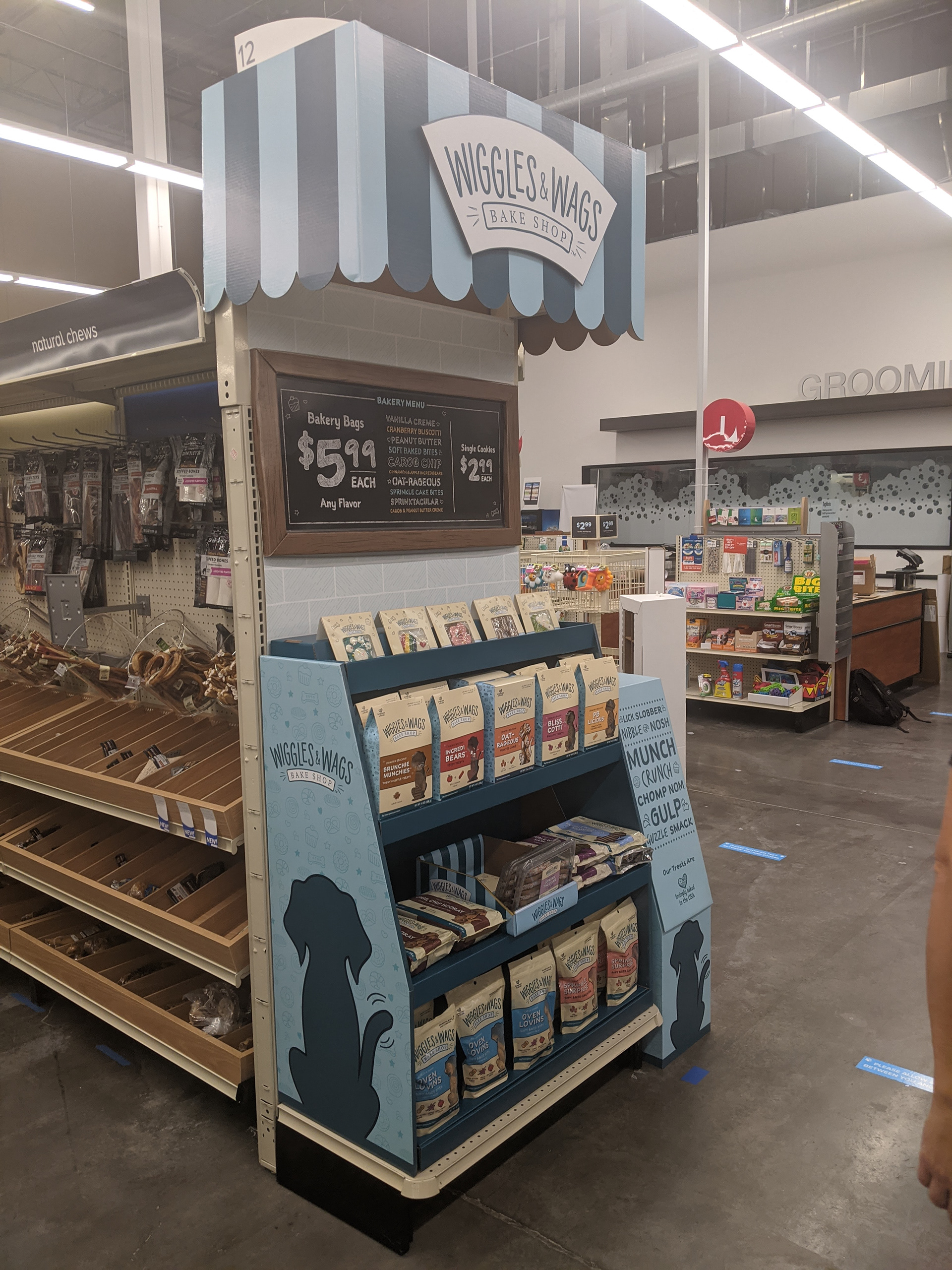
IN-STORE LAUNCH
To support the launch of Wiggles & Wags, I lead the design portion of the endcap display, pairing with the Store Design team to prototype a corrugated bakery case to display the product in a huge way. Located on the prime first endcap, we worked with our vendor to develop an awning structure to cover the endcap header. To accommodate the difference between 3ft and 4ft endcaps, we created a filler box with branding elements to fill in the space on the 4ft versions.
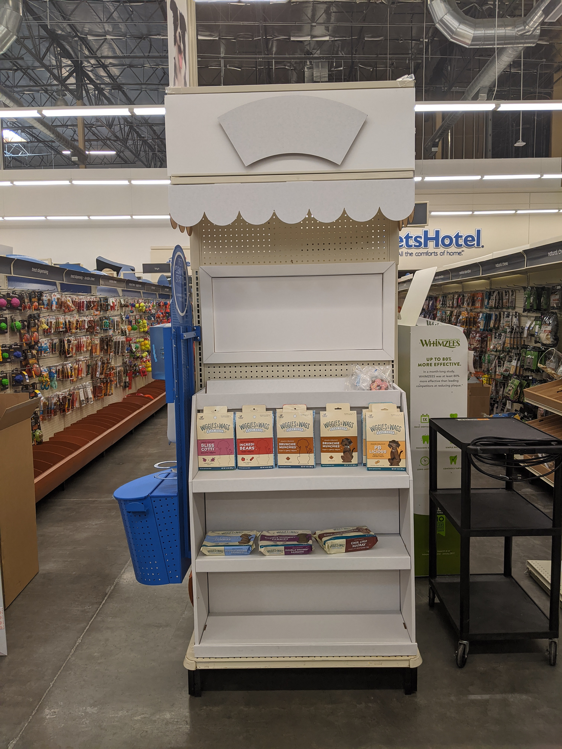
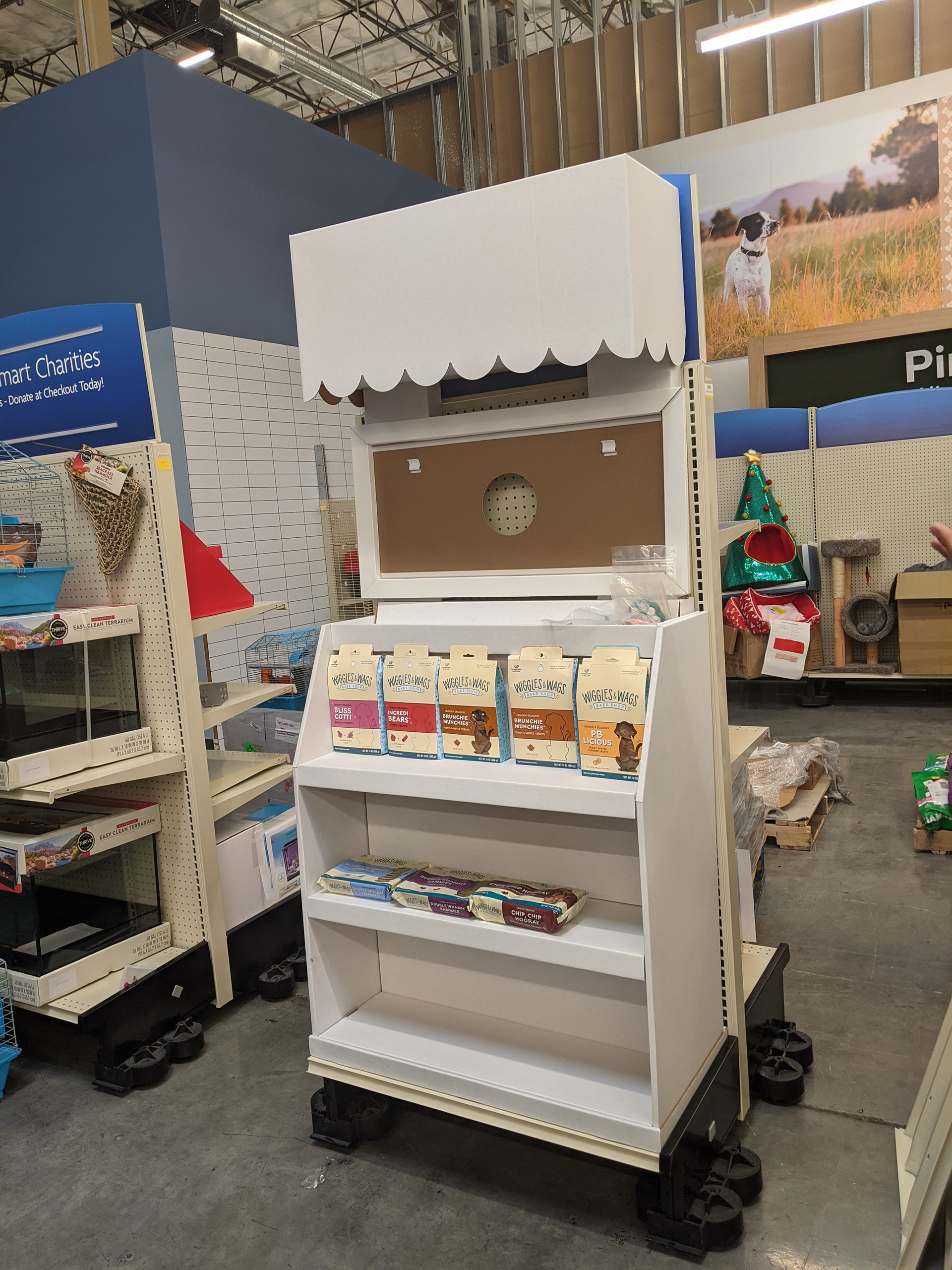
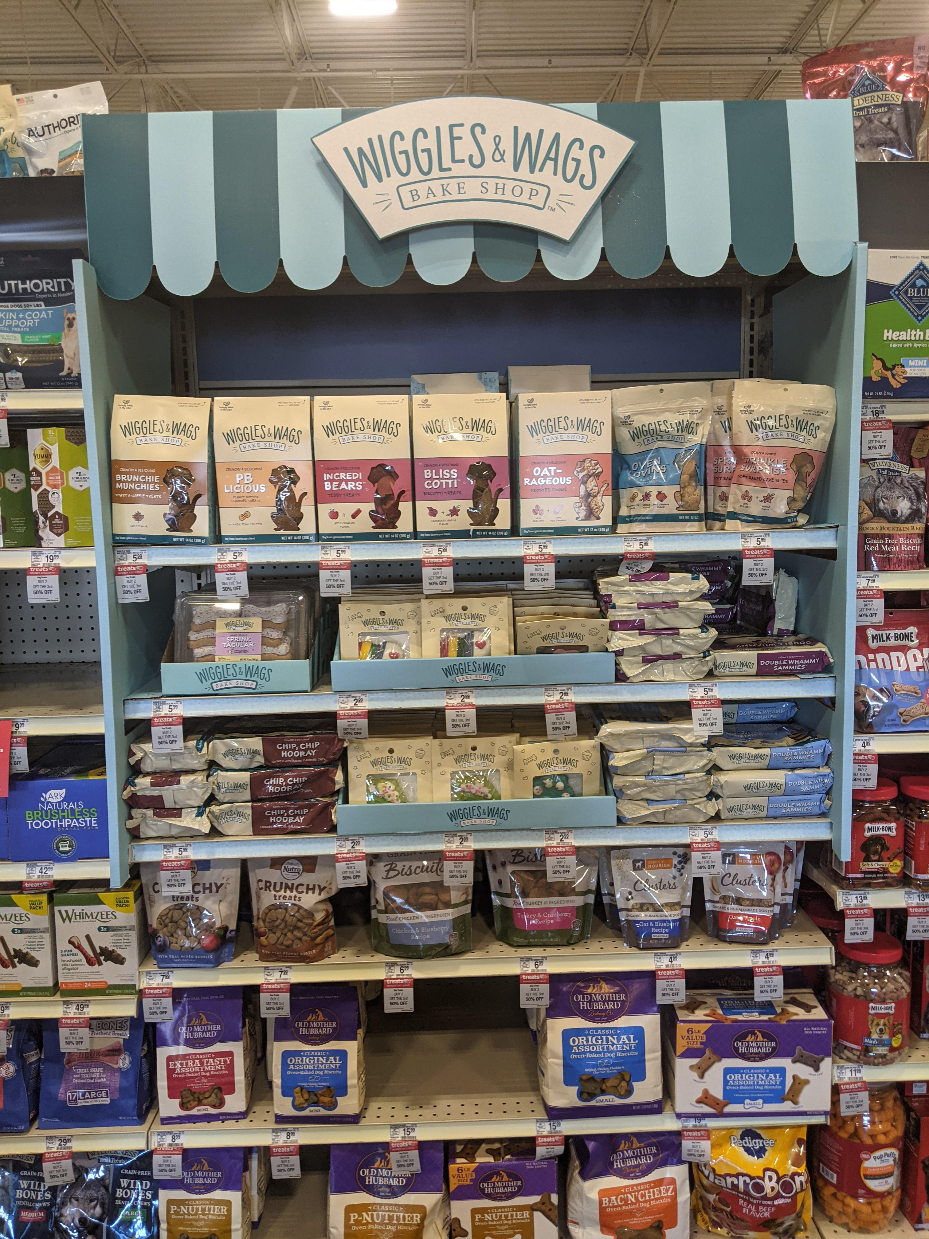
IN-LINE DISPLAY
After the successful launch of Wiggles & Wags, the product was moved to the treats aisle. A mini corrugated display was created to differentiate Wiggles & Wags from the surrounding treat brands.